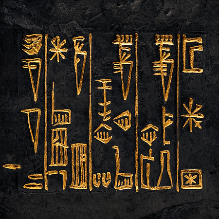
Gold-painted inscription against a darkened background. Originally based on an
ancient Sumerian tablet. Credits to
Google Gemini for helping with "contrast painting", and the
Library of Congress for providing a photo of the tablet.
Building on commentary from
my first submission, I went one step further here by rotating the contrast-painted image 90 degrees clockwise. Nothing complicated, just one simple adjustment. Rotated 90 degrees clockwise specifically instead of any other value or direction because of a little thing called gravity, and how it has a way of affecting visual perception. In other words, these symbols / characters no longer look like they're "floating in free space" anymore; to me at least it looks like there's a ground level anchoring everything together, with vertical walls as separators to boot.
Not needing to know what exactly the symbols represent because to be honest I don't. I only started researching Sumerian history & linguistics. But I also suspect the ancients weren't trying to deceive us with tricky rocket science when they wrote stuff down. To the contrary they wanted to simplify things, and developed a system everyone could agree upon in order to make life easier.
So without knowing what the symbols actually mean, I can already look to other clues like how gravity works to introduce a ground level. And sure enough, it looks like the structures line up pretty well in this gravity construct after rotating the original image 90 degrees clockwise. If I didn't know any better, there even seems to be some sort of chronological progression going on from left to right (or right to left), and furthermore, some symbols look to make sense when compared to early Sumerian writing. But I will leave it at that for now as my research continues...